
One of the things we spend a lot of time learning about when studying floristry is the art of colour.
Blending colours together, highlighting perfect blooms and creating colour harmonies that reflect joyous moods, gentle sympathies or passionate romance. We know how colour works to create pleasing floral arrangements.
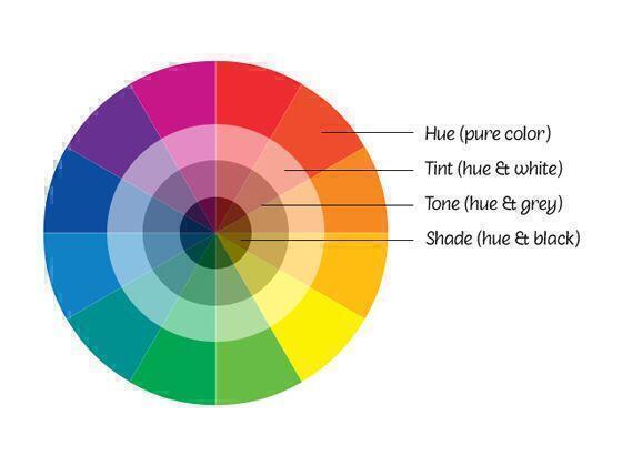
One of the most useful tools in our florist toolbox is the colour wheel - used for visualising colour harmonies.
Working within a colour harmony for floral arrangements to co-ordinate will create a look that is pleasing to the eye. Whether a wedding, ball, or special event, or an arrangement to enhance your home or office decor, giving consideration to colour scheme will ensure you get the best results.
The right colour matching can even make you look slimmer!
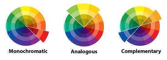
For example, a pretty bouquet in shades of soft pink, rose, cerises through to dark burgundy would be in this colour harmony. These create a very compatable colour match - very soothing and balanced design.
Analogous colours are any three colours which are side by side on a 12 part colour wheel, such as yellow-green, yellow, and yellow-orange. Usually one of the three colours predominates.
Especially relation to wedding flowers, this is why white flowers with greenery in several shades from lime to dark forest green, look so good against white wedding gowns. White on white gives you a clean, fresh look, it will make you look taller and slimmer as it does not "cut your sillouhette in half", the soft, restful colour harmony will certainly be pleasing to the eye.
Complimentary colours are any two colours which are directly opposite each other, such as red and green and red-purple and yellow-green. These opposing colours create maximum contrast and maximum stability.
In decor situations, a contrasting complimentary colour can be used to create a dramatic effect.

Jo-Ann Moss is the Creative Director at Best Blooms, an Auckland florist providing fresh flower delivery across the city. Jo-Ann writes about flower gifting, floral care tips, and how to choose the right bouquet for every occasion.
19 August 2020, 10:23 PM
Like this article 945 others enjoyed this article
Seasonal Flowers in New Zealand
Traditional Wedding Anniversary Gifts by Year NZ (1781 likes)
🌸 Birth Flowers, Birthstones & Star Signs – A Fun NZ Guide (1693 likes)
10 Tips How to make your Flowers live Longer - Flower Care Tips NZ (1562 likes)
Why Best Blooms Loves New Zealand Grown Flowers (1473 likes)
Christmas Celebrations - Guide to New Zealand's most popular Flowers at Christmas (1471 likes)